
fragrance overview
notes collapsed

after


before


blabliblu
the ux case study
product background
Smelling good shouldn't have to come at a premium. Basics should not be priced luxury.
The solution proposed
BlaBliBlu offers affordable perfumes, oils and body washes without compromising on fragrance.

home page- blabliblu
“Oh wow, 50% off! That sounds good. The navigation bar feels slightly congested, though.”


about the product- blabliblu
“This product feels good. But what do I do with the notes section? I don't really understand them.”
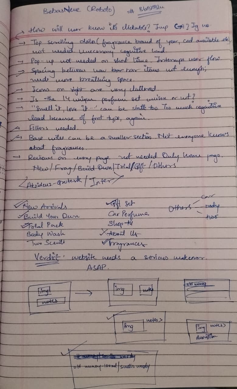
after putting on the ux designer hat, sketching and observing
I identified the following key UX refinements:

before

after

Nav Bar Simplified
Search Bar Repositioned
project scope and constraints
• Preserve BlaBliBlu's visual identity while focusing solely on UX improvements identified through observation.
• Keep the redesign focused on the identified UX issues; other core product features remain unchanged.
• Improve search and navigation while creating more visual breathing room between elements.
• Simplify the fragrance experience by consolidating notes into one button and presenting the fragrance identity in one simple word.
with observation, thought and passion
vartika tiwari